Business Intelligence Dashboard for Small Shops gives you clear control over sales, inventory, and profit. You stop guessing. You act with data. This guide shows you how to build charts and reports fast using simple tools.
This is where Business Intelligence (BI) dashboards come in. You don’t need to be a data scientist or spend thousands of dollars to gain clarity on your business. In fact, many small shop owners are discovering that a simple, well-designed BI dashboard can be built with accessible tools and basic data skills.
In this guide, we’ll walk through everything you need to know to build a dashboard that actually works for your shop—without the complexity.
Business Intelligence Dashboard for Small Shops Explained
A BI dashboard is a visual display of your most important business metrics. Think of it as a cockpit for your shop. Instead of digging through spreadsheets or receipts, you see at a glance:
- How much revenue you’ve made today, this week, or this month
- Which products are selling best
- Customer trends and purchasing patterns
- Inventory levels and stock velocity
- Cash flow health
- Staff performance metrics
The magic of a dashboard is that it turns raw data into actionable insights. A good dashboard answers questions before you even have to ask them.
Why Every Small Shop Needs a BI Dashboard
You might think BI dashboards are only for big corporations. Not true. Small shops actually benefit more from dashboards because:
Speed matters. When you’re the owner wearing multiple hats, every minute counts. A dashboard saves you time by highlighting what needs attention right now.
Margins are tighter. A 5% improvement in inventory turnover or a 3% reduction in waste can make a real difference to your bottom line. Dashboards help you spot these opportunities.
Growth requires data. As you scale, you can’t rely on gut feel anymore. Dashboards let you make decisions based on evidence, not guesses.
Competition is real. Understanding your customer behavior better than competitors gives you an edge. Dashboards make this possible without expensive consultants.
Step 1: Choose Your Data Sources
Before you can visualize anything, you need data. Start by auditing what data you already have access to:
Data Sources for a Business Intelligence Dashboard for Small Shops
Point of Sale (POS) systems: If you use Shopify, Square, Toast, or another POS, you have a goldmine of transaction data. Most offer some built-in analytics, but exporting raw data gives you more flexibility.
E-commerce platforms: Shopify, WooCommerce, and BigCommerce all provide sales, customer, and product data that can be exported or connected via API.
Accounting software: QuickBooks, Xero, and FreshBooks contain revenue, expenses, and cash flow data that’s essential for financial dashboards.
Google Analytics: If you have an online store or website, Google Analytics shows traffic, customer behavior, and conversion data.
Manual data: Sometimes the best data is what you track yourself—customer counts, foot traffic, weather conditions, or local events that impact sales.
Inventory management: Tools like TradeGecko or even a well-organized spreadsheet can track stock levels and movement.
Prepare Data for Your BI Dashboard
Most modern business tools allow you to export data in CSV or Excel format. Here’s the process:
- Log into your POS or business platform
- Navigate to the reports or data export section
- Select the date range and metrics you want
- Export as CSV or Excel
- Store these files in a consistent location (a shared cloud folder works great)
You can do this manually once a week, or set up automated exports if your tools support it.
Step 2: Prepare Your Data
Raw data from your business tools is rarely “ready to visualize.” You’ll need to clean and organize it. This doesn’t require coding—spreadsheets are perfect for this.
Basic Data Cleanup
Remove duplicates: Ensure each transaction or customer is counted once.
Fix formatting: Make sure dates are consistently formatted (2024-01-15, not 1/15/24 in some rows and 01/15/2024 in others). Ensure currency values don’t have dollar signs if you’re doing calculations.
Fill gaps: If you’re missing data for certain days or products, note it. You might need to explain these gaps in your dashboard.
Create calculated fields: This is where you add value. Common calculations include:
- Revenue = Quantity × Price
- Profit = Revenue − Cost of Goods Sold
- Growth Rate = (This Month − Last Month) / Last Month × 100
- Customer Lifetime Value = Total Revenue from Customer / Number of Purchases
Organize into a “Fact Table”
Think of this as your master spreadsheet. Each row is a transaction or data point, and each column is a metric (date, product, quantity, revenue, profit, customer segment, etc.). This organized format makes visualization much easier.
Step 3: Choose Your Dashboard Tool
You don’t need expensive enterprise software. Here are solid options for small shops:
Spreadsheet-Based (Most Accessible)
Google Sheets or Excel with built-in charts
- Pros: Free or cheap, intuitive, everyone knows how to use them
- Cons: Limited interactivity, slower with large datasets
- Best for: Very simple dashboards with basic metrics
Google Data Studio (Now Looker Studio)
- Pros: Free, integrates directly with Google Sheets, Google Analytics, and some business tools
- Cons: Limited customization, slower than paid options
- Best for: Getting started; good for small datasets
Low-Code/No-Code Tools (Recommended for Most Small Shops)
Metabase
- Pros: Open-source and free, intuitive interface, great documentation
- Cons: Requires some technical setup; best results with databases
- Best for: Shop owners willing to spend a few hours setting up
Tableau Public
- Pros: Powerful, beautiful default designs, large user community
- Cons: Free version has limitations; paid version is pricey
- Best for: Visual-first thinkers who want stunning dashboards
Power BI
- Pros: Integrates with Microsoft ecosystem, powerful capabilities, reasonable pricing ($10/user/month)
- Cons: Steeper learning curve than some alternatives
- Best for: Shops already using Office 365
Code-Based Tools (For Tech-Savvy Owners)
Superset, Grafana, or custom React dashboards
- Pros: Maximum flexibility, can be made very custom
- Cons: Requires development skills
- Best for: Shops with technical expertise or budget for a developer
Our Recommendation
For most small shops, we recommend starting with Google Sheets + Looker Studio. It’s free, integrates well with common tools, and requires minimal learning curve. As you grow, you can migrate to a more powerful tool.
Step 4: Design Your Dashboard
A great dashboard is like a great storefront—it should draw attention to what matters most and be easy to navigate.
Start with Your Key Questions
Before you add a single chart, ask yourself:
- Sales: How much revenue am I making? Is it growing? Where is it coming from?
- Inventory: Which products are moving? What’s sitting on shelves?
- Customers: Who are my best customers? Am I getting new ones?
- Operations: What are my costs? Am I profitable?
- Trends: What patterns do I see? Seasonal? Daily?
Only add metrics to your dashboard that help you answer these questions.
The Rule of Three
A dashboard shouldn’t overwhelm. Aim for 3–5 key visualizations on your main dashboard. You can have secondary dashboards for deeper dives.
Layout Principles
Top and left are prime real estate. Put your most important metrics where they’re seen first.
Group related metrics. Sales together, inventory together, customer data together. This helps viewers understand relationships.
Use one color per metric family. Sales in blue, costs in red, inventory in green. Consistency helps comprehension.
Include a date filter. Make it easy to look at different time ranges without rebuilding the whole dashboard.
Step 5: Choose Your Charts
Different data tells different stories. Here’s a guide to choosing the right visualization:
Revenue and Sales Metrics
Line Chart: Shows trends over time (daily sales, monthly growth). Perfect for spotting seasonal patterns and whether business is improving.
Bar Chart: Compares performance across categories (revenue by product, by location, by day of week). Makes it easy to see which items are strongest.
Pie Chart: Shows composition (what percentage of sales come from each product category). Use sparingly—humans are bad at comparing pie slices.
Combination Chart: Overlay two metrics (revenue as bars, growth rate as a line). Useful when you want to show both absolute numbers and trends.
Example Dashboard: A line chart showing daily revenue for the past 30 days, paired with a bar chart showing revenue by product category.
Inventory Metrics
Horizontal Bar Chart: Shows stock levels by product, making it easy to spot items running low. Can include a “reorder threshold” line.
Scatter Plot: Plot slow-moving items (low sales velocity vs. high stock). Items in the top-left are costing you money and should be discounted or removed.
Heat Map: If you have multiple locations or times of day, color-code by sales volume. Red = hotspots, blue = slow periods.
Example Dashboard: A horizontal bar chart of top 10 products by stock level, plus a scatter plot of velocity vs. inventory.
Customer Metrics
Donut Chart: Distribution of new vs. repeat customers. Shows what percentage of sales come from loyal customers.
Table with Conditional Formatting: Top 10 customers by revenue, color-coded by frequency. Simple but informative.
Funnel Chart: If applicable (leads → visitors → buyers), shows where you’re losing potential customers.
Example Dashboard: Number of customers this month (big bold number), split of new vs. returning (donut chart), top 5 customers (table).
Financial Health
Waterfall Chart: Shows how you get from revenue to profit—revenue down to cost of goods, down to operating expenses, down to net profit. Incredibly clarifying.
Gauge Chart: Current profit margin with a target range. Simple visual shows if you’re healthy.
Stacked Area Chart: Revenue stacked on top of cost over time. Shows if margins are improving or worsening.
Example Dashboard: Month-to-date revenue (big number), profit margin gauge, and a waterfall chart showing the path from revenue to profit.
Operational Metrics
Scorecard: Simply show key metrics (transactions today, average transaction value, items sold). No chart needed—just clear numbers.
Performance Over Time: Line or bar chart of units sold, transactions per day, or average transaction value.
Example Dashboard: Transactions today, average transaction value, items sold (all as scorecards), plus a line chart of transactions for the past 30 days.
Step 6: Build Your First Dashboard (Practical Walkthrough)
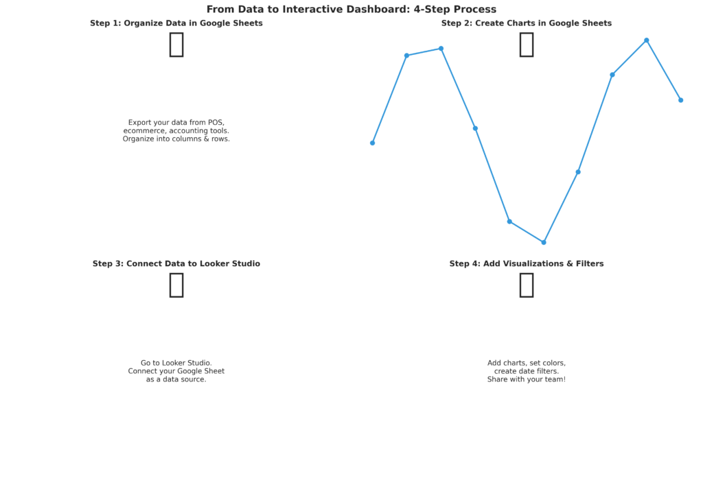
Let’s build a simple example using Google Sheets and Looker Studio.
Part 1: Prepare Your Data in Google Sheets
Create a sheet with columns:
- Date
- Product Category
- Quantity Sold
- Revenue
- Cost
- Profit (Revenue − Cost)
Fill in your data. Even one month of data is enough to start.
Part 2: Create Charts in Google Sheets
- Select your data range
- Go to Insert → Chart
- Choose chart type (Line for trends, Bar for comparisons)
- Customize the title and colors
- Check “Insert on sheet”
Repeat for 3–4 different charts (revenue trend, top products, profit margin, etc.).
Part 3: Move to Looker Studio (Optional, but Recommended)
- Open Looker Studio (looker.studio)
- Create a new report
- Click “Connect to Data”
- Select your Google Sheet
- Add a table or choose “Use as data source”
- Add visualizations by clicking “Add Chart”
- Select each metric and chart type
- Add a date range filter at the top
Result
You now have an interactive dashboard. Toggle the date range, and all charts update automatically.
Step 7: Automate Data Refresh
A dashboard is only useful if the data is current. Here’s how to automate:
If Using Google Sheets
Manual but easy: Set a calendar reminder every Friday to export and paste new data. Takes 5 minutes.
Partially automated: Use Google Apps Script or Zapier to pull data automatically from your POS or accounting tool.
Fully automated: Integrate via API if your tools support it (many do).
If Using Looker Studio
Looker Studio can connect directly to many data sources. If you connect to your POS system directly (instead of a static spreadsheet), data refreshes daily or on demand. Check if your tool has a Looker Studio connector.
Common Pitfalls to Avoid
Too much data: A dashboard with 50 metrics is useless. Stick to 5–7 key metrics.
No context: A big number with no comparison is meaningless. Always show trends or targets. “Revenue: $5,000” is less useful than “Revenue: $5,000 (+15% vs. last month).”
Outdated data: A dashboard with stale data is worse than no dashboard. Commit to a refresh schedule and stick to it.
Wrong metrics: If you’re not using the dashboard to make decisions, you’re measuring the wrong things. Adjust based on what actually matters to your business.
Poor formatting: Hard-to-read fonts, confusing colors, or cluttered layout kills usability. Take time to make it clean.
Taking It Further: Advanced Ideas
Once you’ve mastered the basics, consider adding:
Alerts: Get notified if revenue drops below a threshold or inventory runs low.
Predictive metrics: Use historical data to forecast next month’s revenue or identify your best-selling season.
Cohort analysis: Track customer groups over time (e.g., customers acquired in January, February, etc.).
Attribution: Understand which marketing channels drive sales.
Benchmarking: Compare your performance to industry standards or previous years.
Conclusion
A Business Intelligence dashboard doesn’t require a degree in data science or a huge budget. With the right approach, any small shop owner can build a dashboard in an afternoon that transforms how they understand their business.
Start simple. Pick 3–5 key metrics that answer your most pressing business questions. Use accessible tools like Google Sheets and Looker Studio. Commit to regular data updates. And most importantly, use what you learn to make better decisions.
Your data is already there. Now it’s time to let it speak.
Resources
Free Tools:
- Google Sheets: sheets.google.com
- Looker Studio: looker.studio
- Metabase: metabase.com
Learning Resources:
- Google Sheets charting: support.google.com/docs/answer/185105
- Looker Studio tutorials: support.google.com/looker-studio
- Data visualization best practices: “Storytelling with Data” by Cole Nussbaumer Knaflic
Data Sources:
- Shopify analytics: shopify.com/blog/analytics
- Square Dashboard: squareup.com
- Google Analytics: analytics.google.com
Ready to build your dashboard? Start by collecting one week of sales data in a spreadsheet, create three simple charts, and see what insights you uncover. The best dashboards are the ones you actually use.